
It always great to see professional development opportunities which I co-plan (Kim, Melissa, & I) and deliver taking flight in classrooms. Below is the Lunch N’ Learn topic from April. ‘Student Creation’ or ‘Show What You Know’ was our umbrella topic with subtopic areas to explore including Information Design (Infographics), ThingLink, Google MyMaps, and Student-created Videos.
A couple of my sixth-grade math teachers adapted their lessons on range, mean, median, and mode to include having the students design and create an infographic on data they chose to collect. The teachers started out explaining what are infographics, showing high quality examples including one infographic about infographics (anyone just think of Cosmo Kramer?)
The students voted in Google Classroom using the “Question”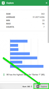 feature with some options being heights of classmates, shoe sizes, etc. They then had an assignment posted with two items, a Sheet set to everyone could edit and a Drawing with a copy for each student. The students recorded their data collected in the Sheet, they then went to ‘File’, ‘Make a Copy’. This way they could sort, arrange and create graphs based on the data. Little tip: in Sheets, highlight all your data and click ‘Explore’ in the bottom right corner. Hmmm…
They then went into the anaylizing phase. They explored the data and determined what they wanted to showcase visually. Some got it right away, others needed feedback and a second attempt. One of the teachers even had the class design a rubric to refer to when creating/editing their infographic. I’ve included the rubric below, as you can see it isn’t designed with point values associated but rather phrases to let students determine if their work is of the “expertly created” fashion.
I want to include some examples (including the one I submitted in first period):
student example 1
student example 2
student example 3
my example